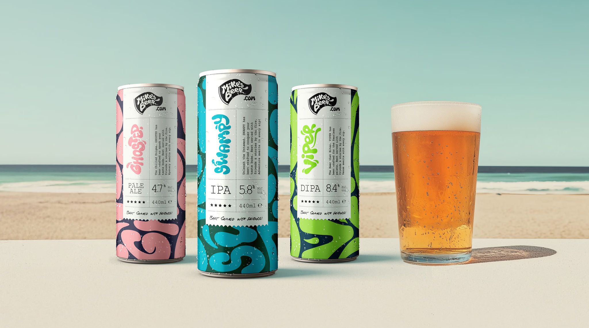
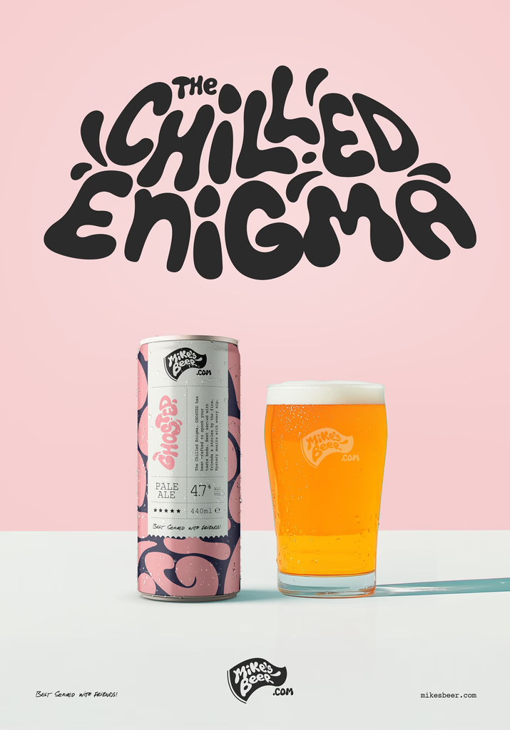
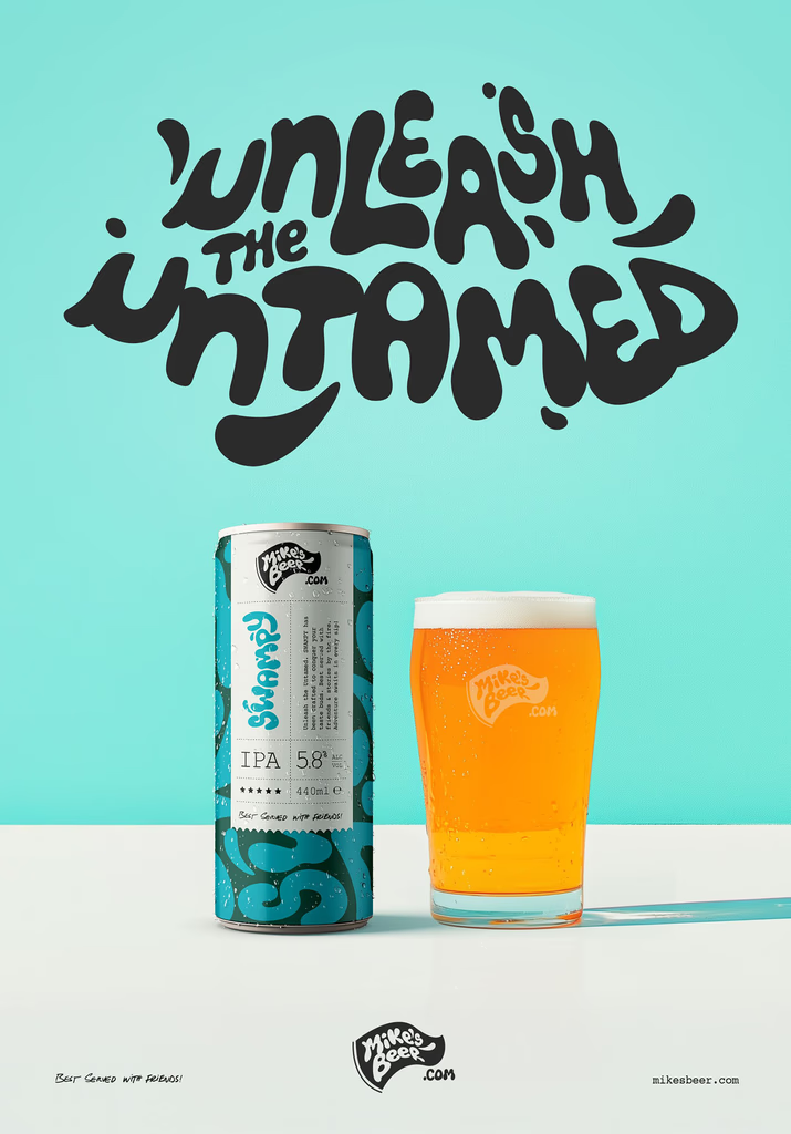
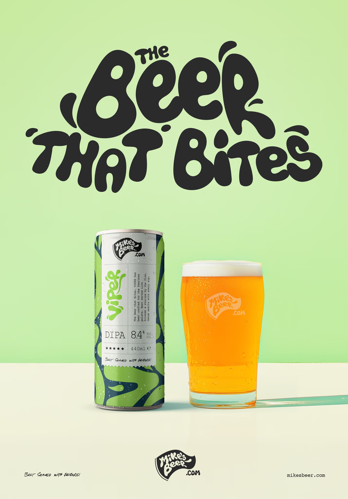
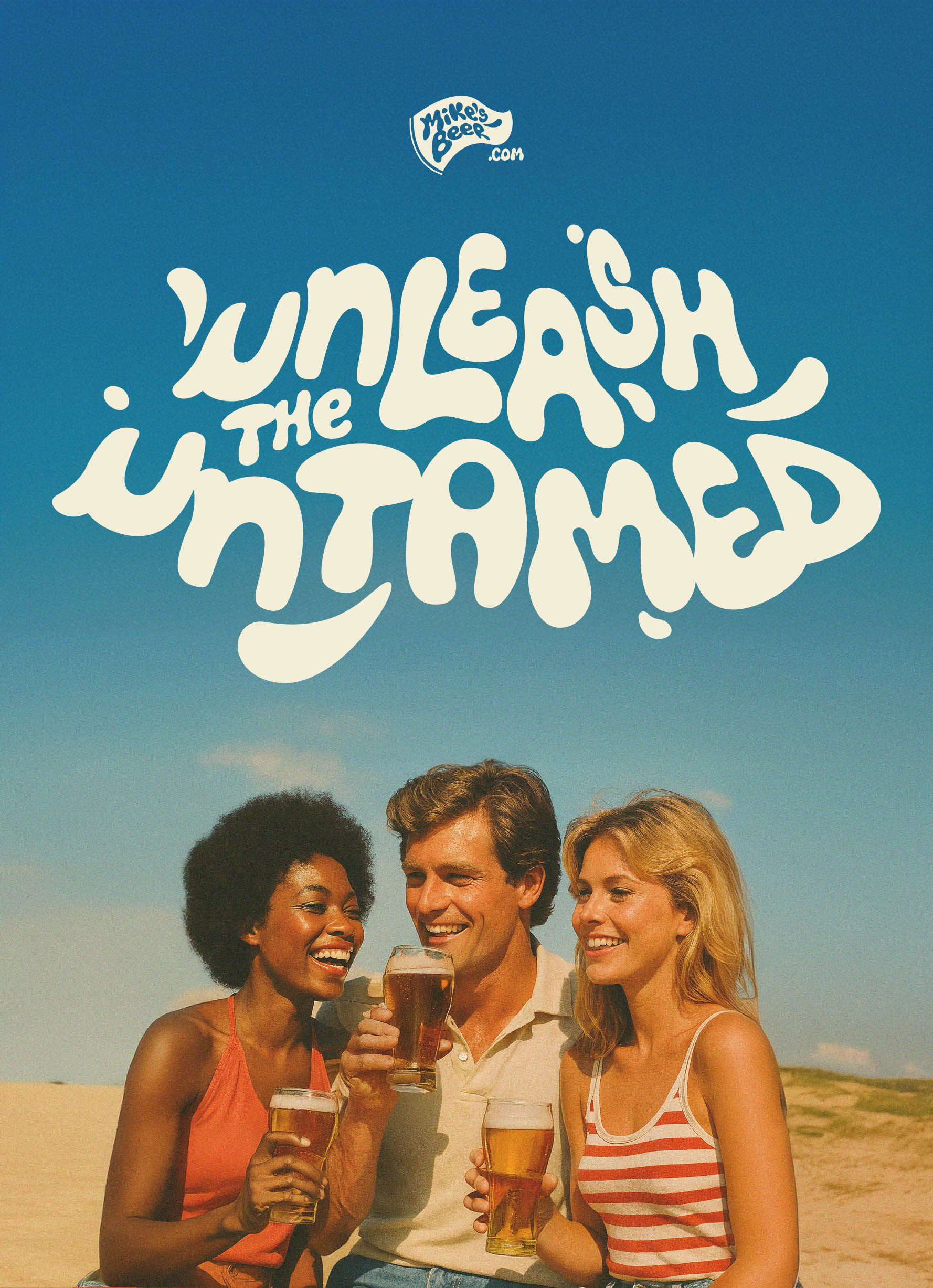
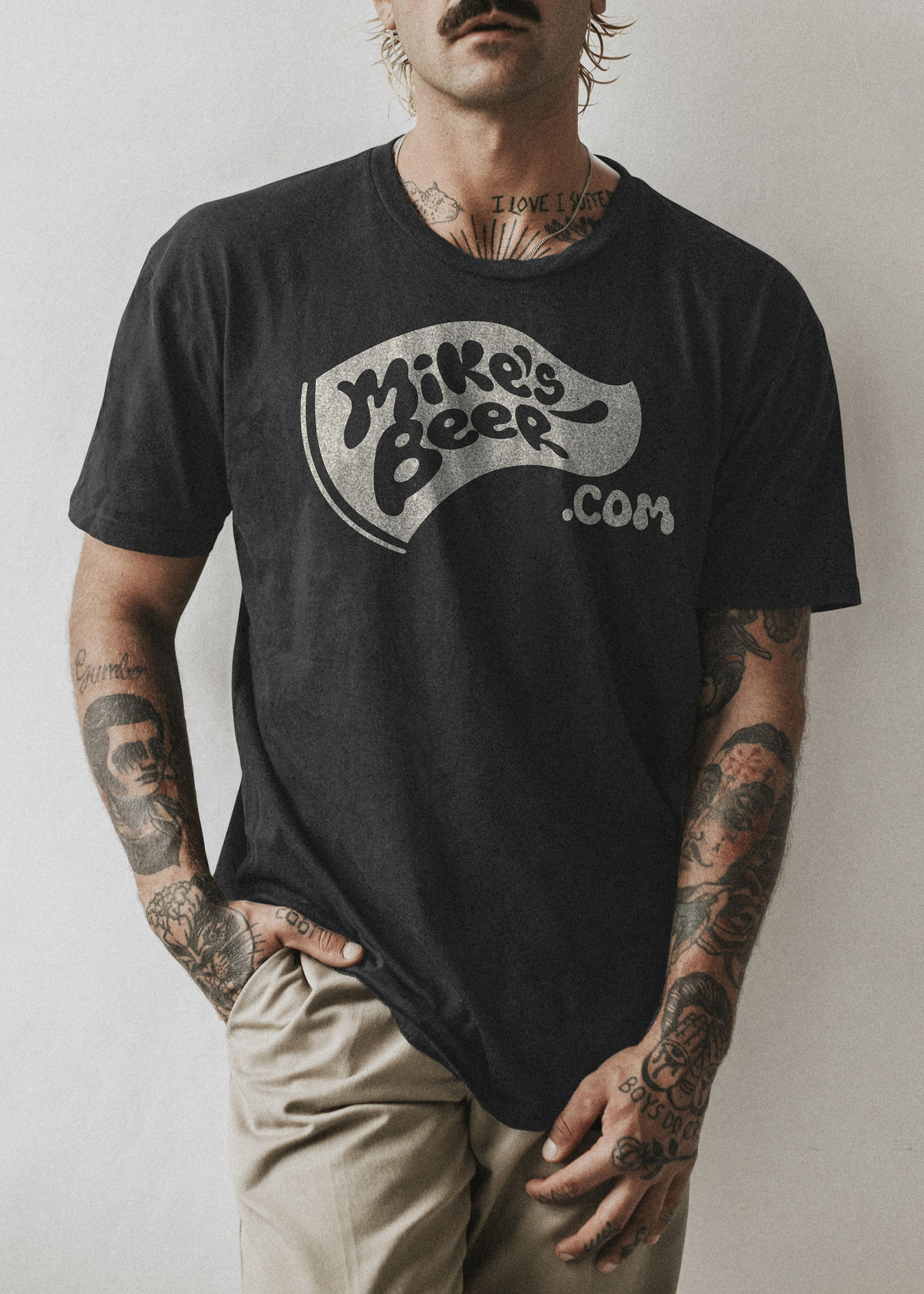
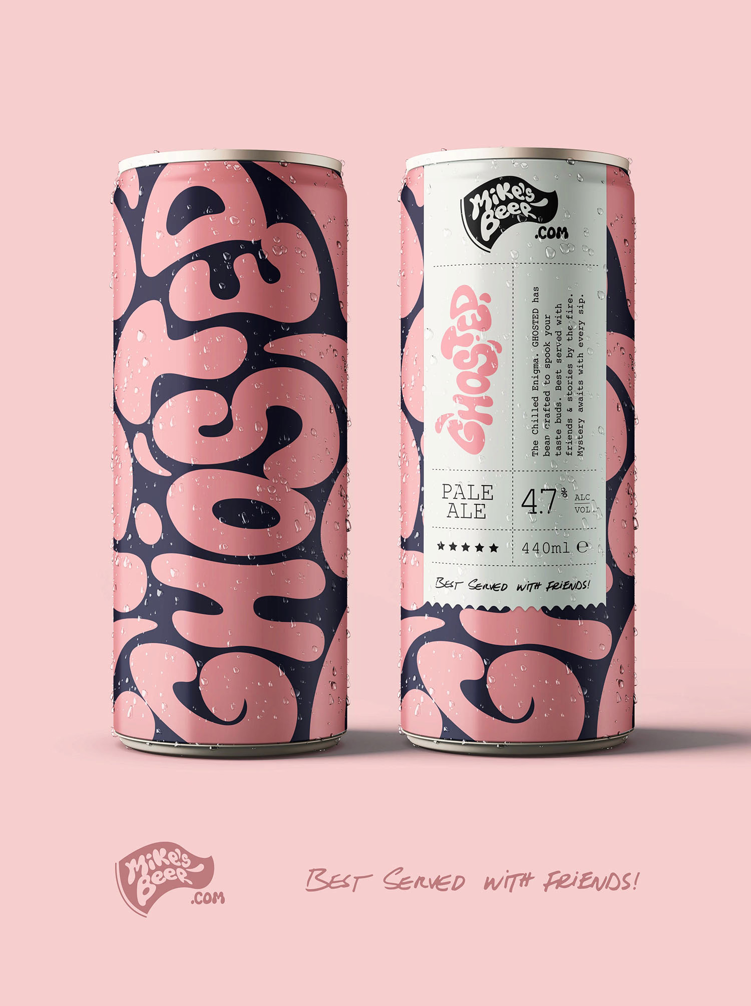
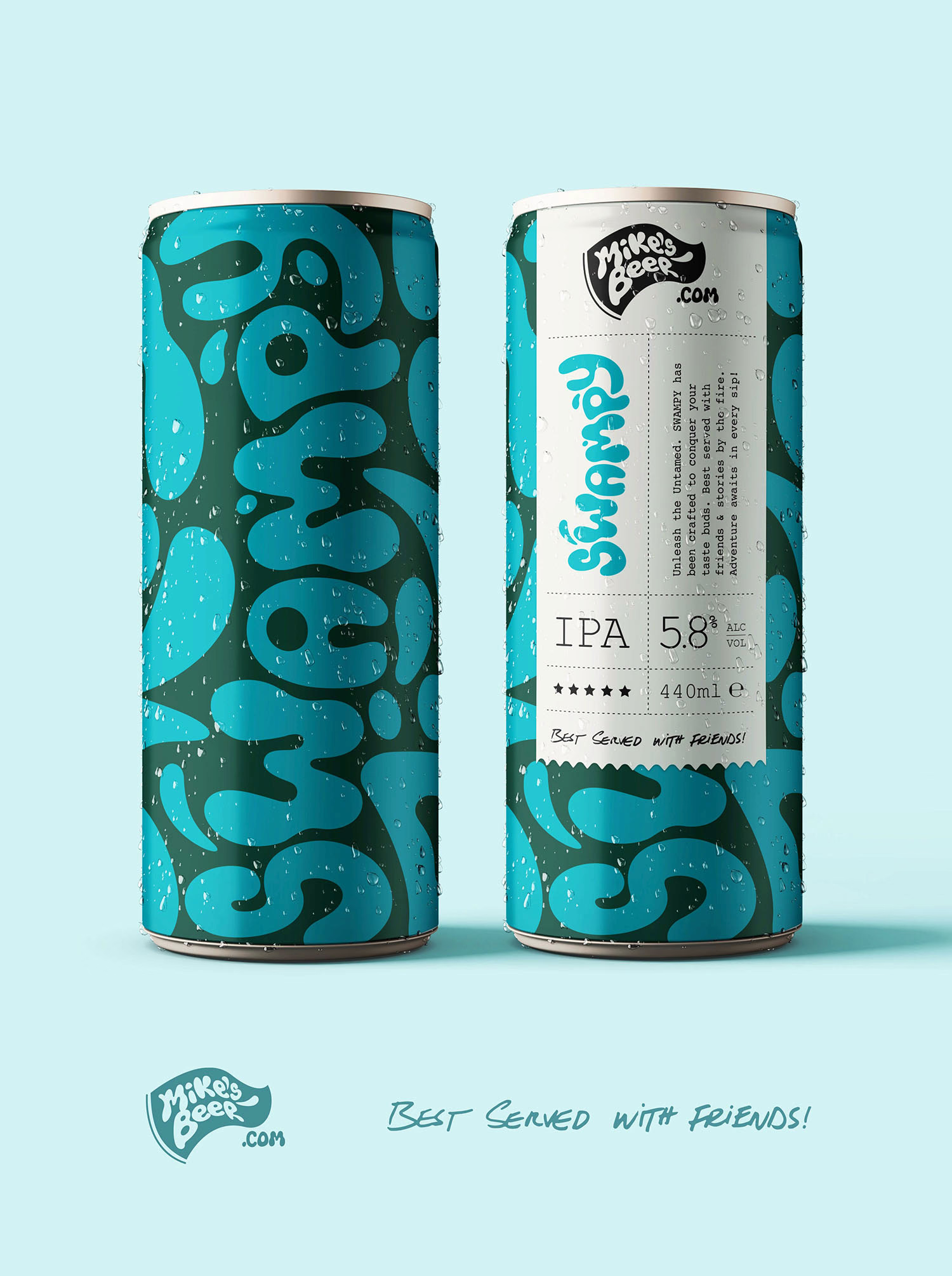
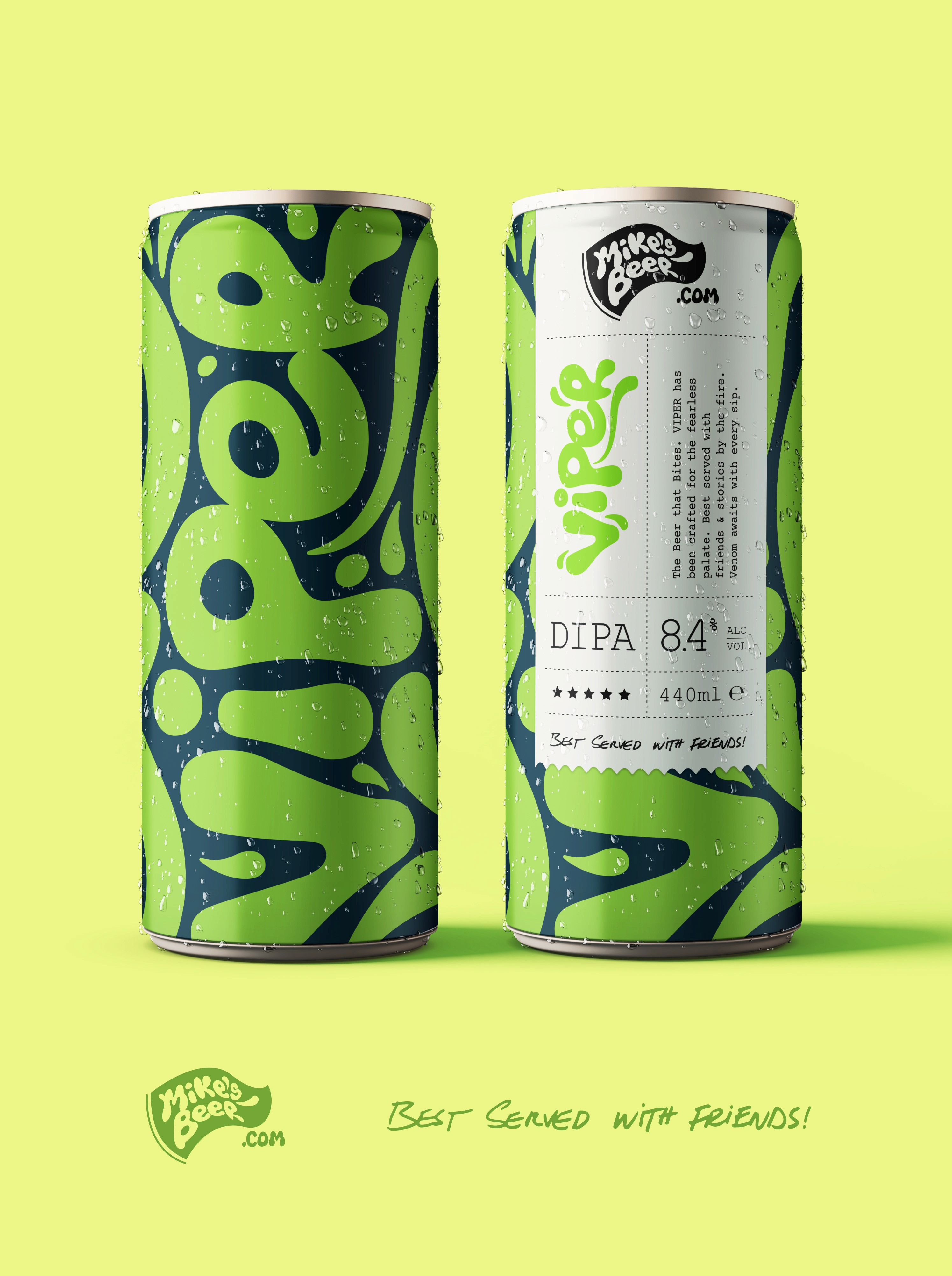
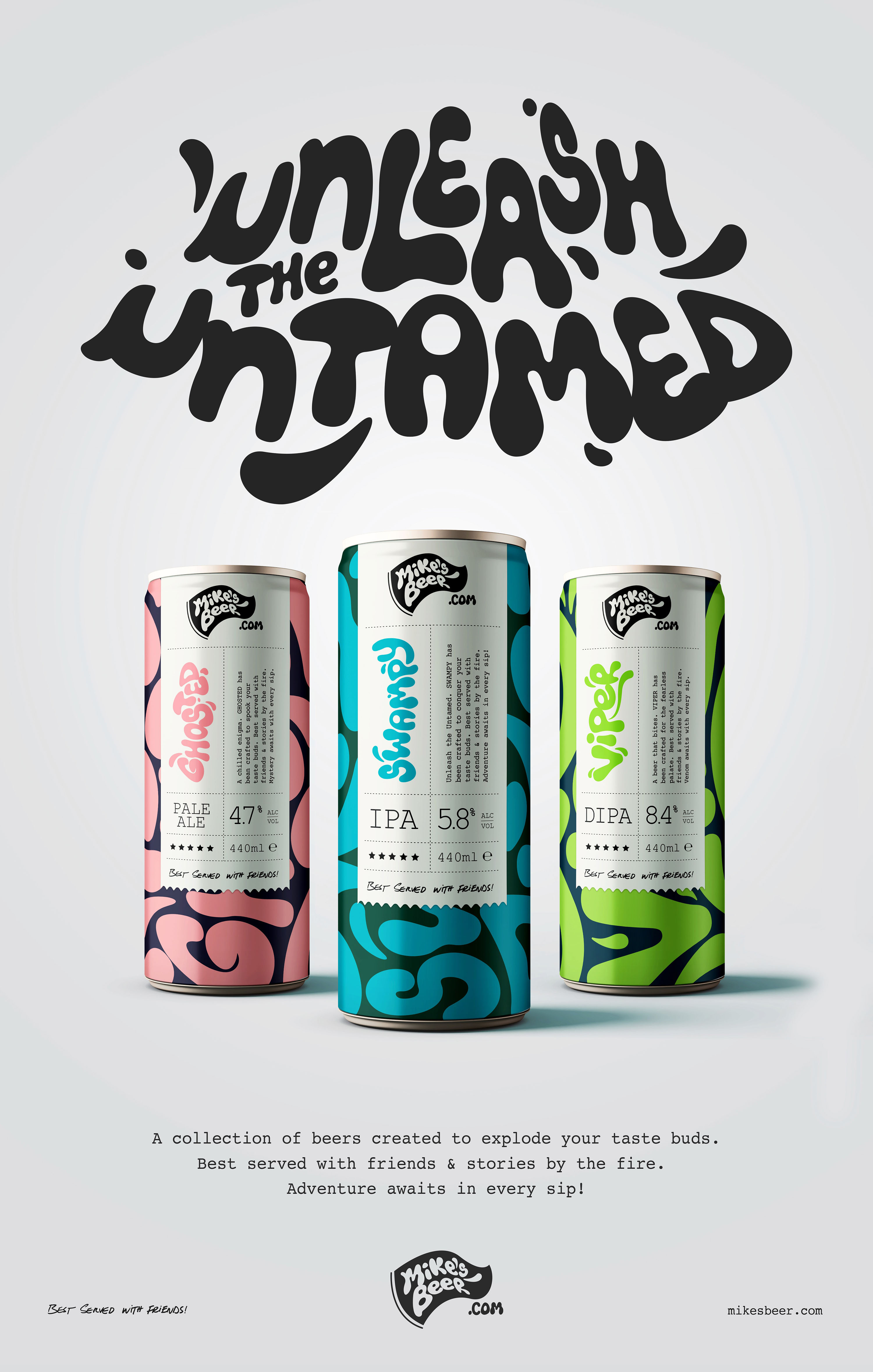
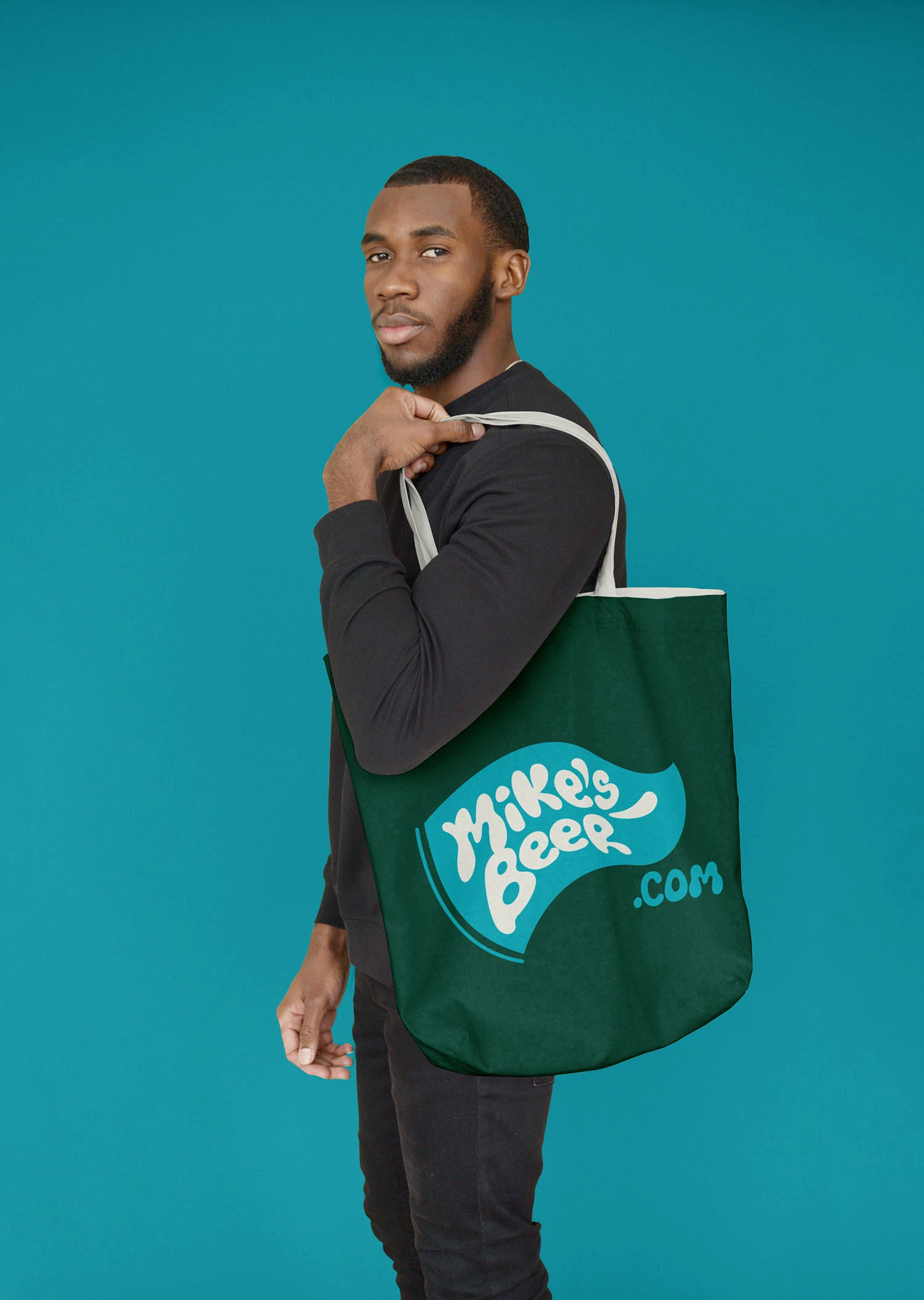
I hand-drew all the typography, scanning and digitising it to create a consistent set of letterforms for use across the branding. I paired these with a selected colour palette of high-contrast, saturated tones to ensure clarity and impact in print and on screen. The layouts combined the hand-drawn type and colour system in a way that could be applied consistently across cans, posters, and merchandise.